
The Album de Statistique Graphique is a set of annual publications of data visualizations in France in the late 1800’s. I first heard about them from Michael Friendly a decade ago and have always been on the lookout to find them. Over the course of my thesis I did find a couple copies in research libraries, but the particular libraries required signing agreements that I would not share the photos (why do libraries do this?).
Now, finally, they are on-line, easily accessible, in high quality scans courtesy of David Rumsey (thank you!). And they are amazing! You can access all of them with a search query.
While I would like to systematically review the Album, that would be a significant multi-year project given the depth of data, the quality of the visualizations, and the time period they are situated in. (Probably of similar scale and scope to Sandra Rendgen’s new book: The Minard System — which I haven’t read yet but is high on my reading list)
So, instead, here’s a few of quick snaps for inspiration.
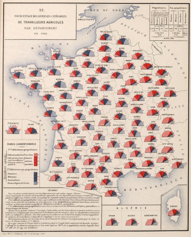
1. Whole pages
Each page is remarkable with many different visualization techniques. A page is a full composition with detailed titles, annotations, visual legends and narrative legends that accompany every visualization. Not only are the visualizations unique, they are authoritative. This particular set of half pies on a map of France from 1882 feels familiar to some the charts in Bertin’s Sémiologie Graphique 80 years later:
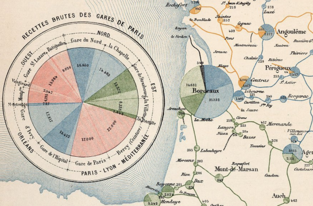
2. Legends
Legends are used to explain many visualizations — presumably some of these visualization techniques are quite new in 1880’s. This particular legend (on the left) acts as both a legend and a summary of the full dataset. These pies are interesting too, using hue to create a top-level hierarchy and brightness as a secondary-level. These pies also work nicely as nodes in a graph (something to consider in the ongoing pie chart debates):
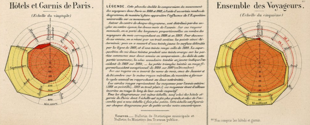
3. Overlapping Colors
With computer-based visualization, it’s really easy to create data-driven geometry — if that geometry is overlapping, then it is also easy to use transparency to help differentiate between the overlapping colors. However, overlapping colors are non-intuitive. We know theoretically that yellow occurs when red and green overlap, but it requires some mental effort to decode. In the Album, this particular radar plot has a filled red object and a filled yellow object: where they overlap it’s alternating horizontal stripes of red and yellow – much more easy to decode if you simply look at the book more closely.
4. Multigraph Lines
For those who think Sankey diagrams are great, here’s an awesome graph visualization. A multigraph is a node-link diagram where there can be more than one link between nodes. In this railway traffic diagram, there are many lines between each town. Four color variants indicates type of traffic, and which side of the center line indicates direction of travel. Line width indicates traffic volume. Corners and joins are neatly beveled. Types of traffic, mainlines, local traffic high volume anomalies are all clearly visible. (Btw, I like many kinds of graph visualizations).

5. Curvy Text
And finally, text on a path. Text annotations follow gridlines and objects, so that text doesn’t disrupt the overall visualization patterns, but still provides relevant information directly in context. Text doesn’t overlap the objects: it curves gently along paths, or angles out if the curves are too tight.
That’s a really quick take on a few examples. I didn’t even get into discussing the average circles on the radar plots or the red overlay text on the multigraph or other interesting aspects. Far better to browse the full set of images over at David Rumsey and draw your own insights.
Links:
RecettesDesStations1882
https://www.davidrumsey.com/luna/servlet/s/455p92
PrixDuTransport1881
https://www.davidrumsey.com/luna/servlet/s/2e3v9k
PourcentageTravailleursAgricoles1882
https://www.davidrumsey.com/luna/servlet/s/wt0024
ExpositionUniverselle1889
https://www.davidrumsey.com/luna/servlet/s/5y7k81
Quotidein de Train1893
https://www.davidrumsey.com/luna/servlet/s/a1vd9l

Pingback: [Blog Reads] January 2019 – Cathartic Student
Pingback: New top story on Hacker News: Album de Statistique Graphique – Outside The Know
Pingback: New top story on Hacker News: Album de Statistique Graphique – Golden News
Pingback: New top story on Hacker News: Album de Statistique Graphique – News about world
Pingback: New top story on Hacker News: Album de Statistique Graphique – Latest news
Pingback: New top story on Hacker News: Album de Statistique Graphique – Hckr News
Pingback: New top story on Hacker News: Album de Statistique Graphique – World Best News
Pingback: Album de Statistique Graphique | My Tech Blog
Reblogged this on ramblingbog.
Pingback: DSB #64 – Data Science Bulletin
Pingback: Maps Leaking Typography into Visualization | richardbrath